Searching for Design Tokens
I was really stuck getting started when thinking of designs for this software.
So, to give myself a bit of a head-start, I went Pinterest (like every other individual).
I was really targeting designs that make product feel trustworthy and friendly instantly.
I saw a bunch of email designs, but one really stood out and felt friendly and inviting.
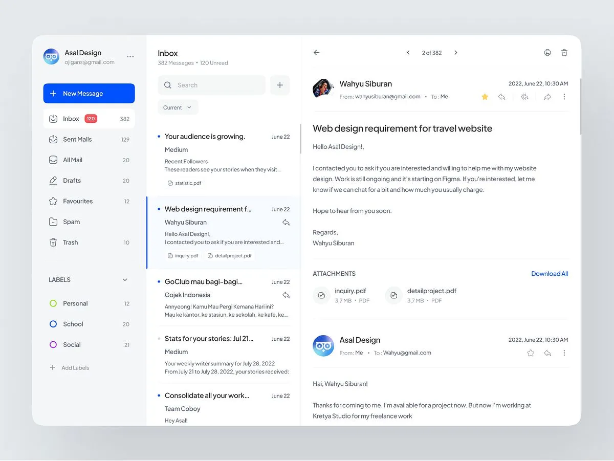
I used that design to pick my design tokens.
-
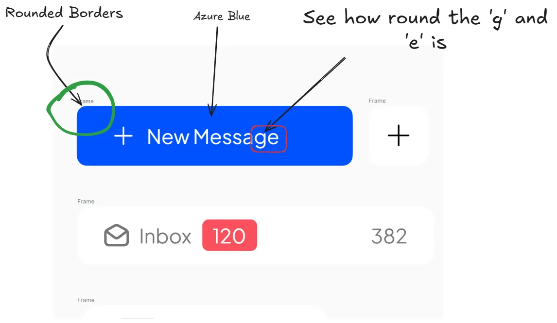
Font: Plus Jakarta Sans (Its super-rounded nature makes the UI feel friendly and trustworthy at first glance)
-
Colour: #0051ff - Azure Blue (The colour makes the UI feel friendly and trustworthy).
-
Rounded-ness: Super-round (It also makes the UI friendly instantly)
Unfortunately, The designs on Pinterest are only one page.
Even though, I used stitch to generate designs of other pages based on other features.
It returned ultra generic designs. So, I scraped it.
I had to use nano-banana to imagine some pages. Since is it not that limited.
Maybe I can’t use stitch yet. I don’t know
For the Icons, Since the borders are rounded, the icons have to be rounded as well.
I couldn’t use material icons since they were a bit sharp at the edges.
I checked iconify icon-sets and found the perfect one; Gravity icons.
These are the comparisons.
![]()
Then, I used Lunacy to think up some micro components on the screen, to determine spacing, gap etc.
For now, the design tokens have been chosen, but the overall wire-frame has not been done yet.